

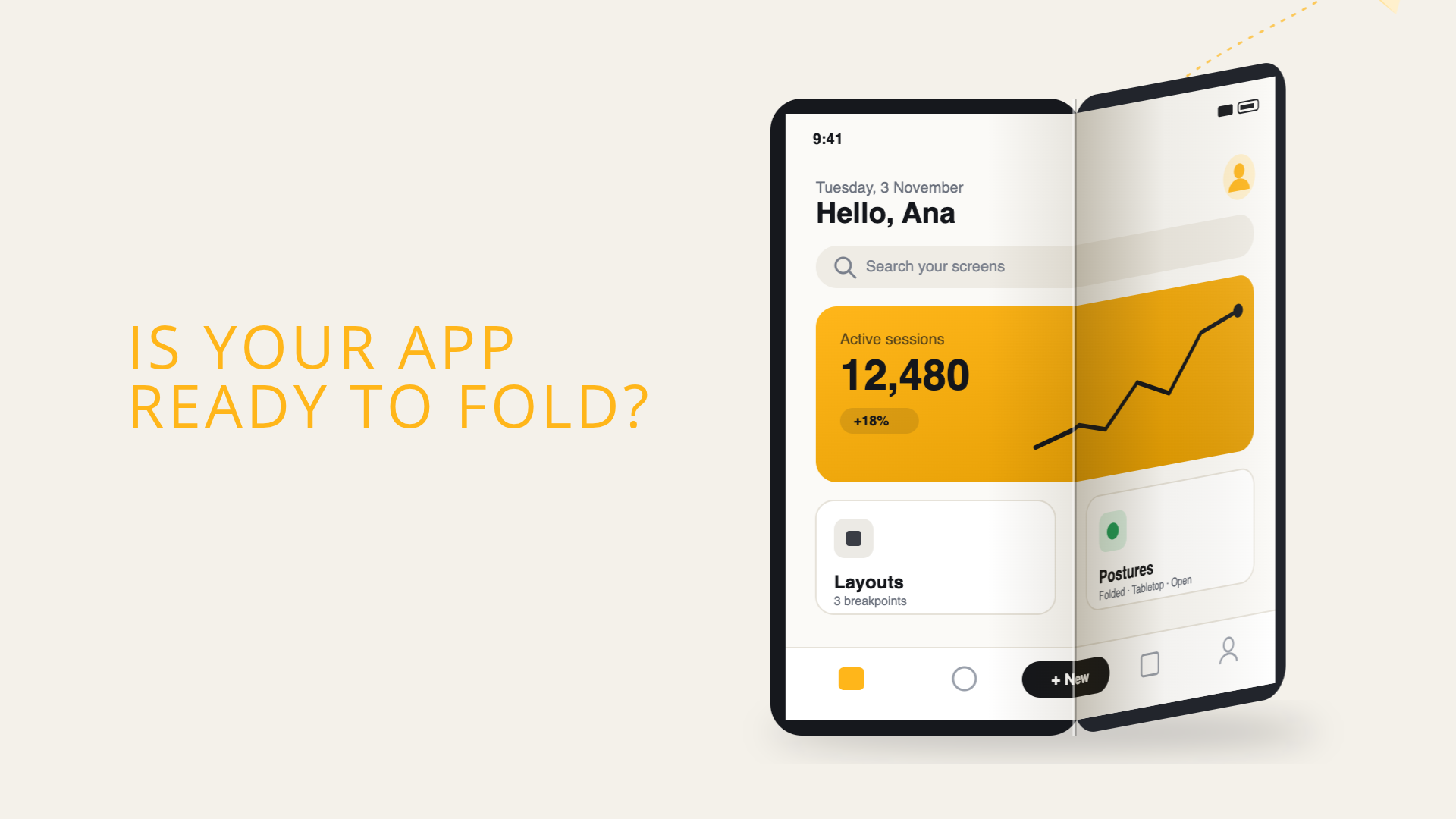
Folding the Rules: What Foldable Phones Mean for Mobile App Developers
For years, foldable phones were the cool gadget in the room that most app teams could safely ignore. They were expensive, rare and, let’s be honest, a little gimmicky. If your app looked odd on one, that was a problem for “later”.
Well, later is now. With Apple launching its first foldable iPhone and Google tightening the rules on large screens, foldables have stopped being an Android curiosity and started changing how every mobile app should be built, whether it’s written in Swift, Kotlin, Flutter or React Native.
This isn’t a hands-on review. Think of it as a heads-up: based on what Apple, Google and the framework teams have published, here’s what mobile developers should be alert to, what makes it tricky, and why one small hardware decision might make our lives a lot easier.

iPhone Duo (left) and Galaxy Z Fold8 (right). Images: Apple, Samsung
Why Foldables Can’t Be Ignored Anymore
In September 2026, Apple introduced iPhone Duo, its first foldable iPhone: a 5.4-inch outer display that opens into a 7.6-inch inner one. When Apple enters a category, developers usually follow, and the numbers suggest this time is no different. Counterpoint Research expects cumulative foldable shipments to pass 100 million units by the end of 2026, with Apple grabbing around a quarter of the market in its first year.
Apple isn’t arriving in an empty room, though. Samsung has been refining its book-style Galaxy Z Fold line for years, and Huawei’s foldables run HarmonyOS Next, which IDC expects to almost double its foldable shipments in 2026. Counterpoint also expects stronger demand for wider book-type devices, the “passport-like” format seen in Huawei’s Pura X Max and Samsung’s new Galaxy Z Fold8.
Foldables still represent a small share of the market, around 2% of all smartphones according to Counterpoint. However, it is a premium segment, and the adaptations foldables require, such as supporting screens that change size, also improve how apps behave on tablets and in split view, while helping to prepare them for future devices.
What Foldables Change for Developers
1. Your Screen Is No Longer Fixed
On a regular phone, the screen size you read at launch is the screen size you keep. On a foldable, the app’s window can change size every time the user opens or closes the device, often in the middle of a task.
Apple’s iPhone Duo guide puts it plainly: orientation no longer tells you what shape your app is, and an iPhone can now have any combination of size classes. That means no more caching sizes at launch, no more “regular width means iPad”, and no more layouts decided by orientation. Instead, measure the space you actually have, and react whenever it changes.
Multitasking adds to this. Android foldables have long supported split-screen and pop-up windows, and on iPhone Duo two apps can share the inner display in Split View, with each app placing its controls along its own outer edge. Your app may end up in a window that matches no physical screen at all.
2. Orientation Locks Are on Their Way Out
Many apps quietly locked themselves to portrait and called it a day. That shortcut is disappearing on both platforms.
On Android, Android 17 (API 37) ignores orientation and resizability restrictions on large screens, with no opt-out (games excepted). And since Google Play will require API 37 from August 2027, this isn’t optional. On iOS, Apple’s Prepare your app for iPhone Duo talk explains that the Duo’s inner display doesn’t honor your supported orientations either. Older UIKit apps have homework before they even get there: apps built with the iOS 27 SDK must adopt the scene-based life cycle or they won’t launch.
3. The Fold Is Part of Your Layout
Foldables bring a new obstacle: the fold itself. Apple calls these areas reserved regions (the fold plus the front cameras) and recommends keeping important content clear of them. System alerts, menus and split views adapt on their own, but custom layouts need the new ReservedRegion APIs. Android developers have had the equivalent for a while through Jetpack WindowManager’s FoldingFeature.
Then there are poses: half-open like a book, set down on a table, or standing on its edge. The good news, according to Apple’s design guidelines, is that we don’t need a custom layout per pose. A compact layout for the outer screen and a regular-width one for the inner screen cover the basics.

Illustration inspired by the device poses in Apple’s Human Interface Guidelines.
4. Toolbars Move to the Side
This one is very iPhone-specific. On the Duo, toolbars, tab bars, the status bar and even the Dynamic Island move to the side of the screen on the outer display, and on the inner display in landscape. Standard system components handle this automatically. Custom ones, and any code that assumes the left and right margins are equal, will need attention.

5. Keeping State When the Phone Folds
Imagine a user filling in a long form, or halfway through a video, who unfolds the phone to see more. If the app forgets what they were doing, the bigger screen becomes a punishment.
On Android, this is a classic trap. As Google’s guide to foldables explains, an app stops and restarts when the device folds or unfolds, so it must save and restore its state to keep the experience continuous. Google’s Save UI states guide covers the tools for this, such as a ViewModel and onSaveInstanceState(). Samsung’s app continuity codelab walks through the same problem on Galaxy Z devices.
On iOS and in cross-platform frameworks, the screen usually isn’t torn down, but the layout often is. When a list becomes a list-detail view, scroll positions, selections, text input and media playback can all reset if state lives inside the views being swapped. Keeping state outside the UI layer, in view models or state stores, solves most of it.
6. Testing Gets a Lot More States
Closed, open, half-open, rotated, side by side with another app: foldables multiply the states to test, along with every transition between them. The tooling is mostly virtual for now. Apple offers an iPhone Duo simulator in Xcode 27.1, and Android Studio includes foldable and resizable emulators, such as the Pixel Fold. Real Android hardware still matters, though, since support for postures like tent mode and for a hinge angle sensor depends on each manufacturer.
The Passport Advantage: Same Shape, Two Sizes
Here’s the part I find most interesting. On iPhone Duo, both displays share the same aspect ratio, which Apple says lets content scale proportionally between the closed and open states. Apple doesn’t give the number, but the published resolutions, 1878 × 2670 pixels inside and 1398 × 2034 outside, work out to roughly 1:1.4. Strictly speaking, that’s about 1.42 for the inner display and 1.45 for the outer one, so “the same” is a slight rounding.
Why does that matter? On many earlier book-style foldables, the cover screen was tall and narrow while the inner screen was almost square. Opening the phone meant a real change of shape, so videos, photos, maps and games had to be re-cropped, letterboxed or laid out from scratch.
There’s also a neat bit of geometry at play. A ratio of about 1.41 is the square root of two, the same ratio used by A4 paper. Fold an A4 sheet in half and each half keeps the same proportions. Turn the Duo’s inner screen sideways, split it at the fold, and each half (about 1335 × 1878 pixels, or 1:1.41, ignoring the fold region) is roughly the shape of the closed phone.

Where It Helps
Content survives the transition. Full-screen media, camera viewfinders, readers and drawing canvases can simply scale up, keeping the same framing.
Compact screens become panes. A screen designed for the outer display can serve as one half of a two-pane layout on the inner display. Apple’s Mail does exactly this: closed, it shows the inbox or an email; open, it shows both side by side.
Where It Falls Short
It helps content more than the interface. Scaling a phone layout up to 7.6 inches just gives you giant buttons. Apple still expects a proper regular-width layout on the inner display.
It’s a new shape compared to other phones. The Duo is much boxier than typical phones. Apple’s guidelines note the outer display is wider and shorter than other iPhones, so content made for tall screens, like vertical video, can end up cropped on both displays.
It’s not universal (yet). Flips, tri-folds and many Android foldables still pair very different screen shapes. Until the rest of the industry follows, coding against available space remains the only safe bet.
In short, matching aspect ratios don’t remove the need for adaptive design, but they make it noticeably cheaper, especially for apps built from self-contained, reusable screens.
Native vs Cross-Platform: Who’s Ready?
Status as of late October 2026, with a focus on native and Flutter. This part moves fast, so check the links before relying on it.

Swift (SwiftUI and UIKit)
Native iOS developers are in the best position, since everything the Duo needs is first-party. How an app looks on the Duo depends on the SDK it’s built with: according to Apple’s preparation guide, apps built with the iOS 26 SDK or earlier appear at a familiar size in the middle of the inner display, apps built with the iOS 27 SDK fill most of it, and only apps built with iOS 27.1 or later go edge to edge. For two-pane layouts, arrangement views (ArrangementView in SwiftUI, UIArrangementViewController in UIKit) rearrange content around the fold, and Xcode’s coding assistant includes an app resizability skill that scans a project for the patterns Apple asks developers to remove.
Kotlin (Android and Jetpack Compose)
Android has had the tools for years, and most of the work happens in the Compose Material 3 Adaptive library, as Google’s adaptive apps guide explains. currentWindowAdaptiveInfo() gives the current window size class, NavigationSuiteScaffold switches between a navigation bar and a navigation rail, and ListDetailPaneScaffold and SupportingPaneScaffold show one or two panes depending on the space. Since version 1.2, these scaffolds also support large and extra-large windows and can reflow panes automatically as the window changes, so much of the adaptive behavior comes ready-made.
Flutter
Flutter’s layout model is a natural fit for resizable screens, and it has exposed folds and hinges through MediaQuery.displayFeatures for a long time. The catch? The official documentation still states this list is populated only on Android, so on iPhone Duo it comes back empty. And since Flutter draws its own widgets, Cupertino bars won’t move to the side like native ones do.
A pull request to the Flutter engine would fill displayFeatures on iOS, but it’s still under review, with no release date yet. Until then, community packages such as foldable and iphone_duo_ui_pro bridge the gap, and fold logic written against displayFeatures today should keep working once official support lands.
The good news is that Flutter’s own adaptive design best practices already point in the right direction: don’t lock the orientation, don’t decide layouts by device type, and measure the space you have with MediaQuery.sizeOf or LayoutBuilder instead. Locking won’t work on large Android screens anyway, since SystemChrome.setPreferredOrientations is ignored for apps targeting Android 17. The same guide also covers keeping state, such as scroll positions with PageStorageKey, when folding changes the layout. Following it today covers most of what foldables need, on Android and iPhone Duo alike.
React Native
React Native has no built-in fold or posture API yet. Official support has been proposed for both React Native and Expo, but until it ships, teams depend on community libraries such as react-native-duo, a risk worth weighing before relying on one in production.
What About HarmonyOS?
If your users include owners of recent Huawei foldables, there’s a third platform to consider. HarmonyOS Next is no longer built on Android, so Android apps don’t run on it directly, and native apps are written in ArkTS. Flutter and React Native support comes from community ports, such as the OpenHarmony Flutter fork, which tend to lag behind the main releases.
Where to Start With an Existing App
Most of the work doesn’t require new APIs, just letting go of a few old habits. For an existing app, a practical order looks like this:
- Audit the assumptions. Look for layouts based on the screen size instead of the window size, sizes measured once at launch, layout decisions based on orientation or device type, portrait-only locks, margins that assume both sides of the screen are equal, and full-screen media cropped without a focal point. Apple’s iPhone Duo checklist is a good starting point for any stack.
- Measure available space. Replace screen-size and orientation checks with the size of the window: size classes in Swift, window size classes in Compose, and
MediaQuery.sizeOforLayoutBuilderin Flutter. - Make sure state survives. Fold, unfold and rotate on every key screen, and move any state that resets out of the UI layer.
- Add a layout for the larger screen. List-detail screens are the natural place to start, reusing compact screens as panes.
- Test every state. Closed, open, half-open, rotated and in split view, first on simulators and emulators, then on real devices.
How much effort this takes depends mostly on the codebase and the stack. A native app that already uses size classes or window size classes may need little more than the audit, while older apps also face migration work, such as adopting the scene life cycle on iOS. Flutter apps can cover most of it with the same steps, but iPhone Duo-specific features, like fold data and side bars, depend on community packages until official support lands. Putting real numbers on that effort requires adapting an actual app, which is why we’re leaving it for a follow-up article.
Adaptive by Default
Foldables are still a niche, but they’re pushing the whole industry toward a simple idea: an app should respond to the space it gets, not the device it thinks it’s running on. For companies, this comes with a fixed deadline, since Google Play will require API 37 from August 2027, and with an audience worth getting right: iPhone Duo starts at $1,999, so foldable owners tend to be high-value customers. And the work pays off beyond foldables, on tablets, in split view and on whatever comes next.
Passport-style foldables, with their matching screen shapes, make the journey easier. They don’t make it optional. Whether you’re writing Swift, Kotlin, Flutter or React Native, the safest bet is the same: build screens as reusable panes, react to available space, and test every fold.
In a follow-up article, we’ll take an existing app and adapt it to foldables step by step, with a closer look at the real effort involved. Follow our blog so you don’t miss it.
Is your app ready to fold? Which part of your codebase do you think would break first?
Building for every screen?
Present Technologies builds and evolves native and cross-platform apps for iOS and Android. Whether you’re starting a new product, modernizing an existing app or preparing for platform changes, we can help you get there.
Let’s talk →
Related Posts

Comments are closed.